More thinly veiled activism from the University of Stirling...
Prominent health warnings on alcohol products make drinking “unappealing”, new study findsYoung adult drinkers are more likely to perceive alcohol products as “unappealing” and “socially unacceptable” if they display prominent health warnings, according to new research.
Straight away we have a problem. Health warnings are not intended to make products "unappealing", let alone "socially unacceptable". They are supposed to give people important information that they might not otherwise have access to. Once consumers are appropriately informed, they can do what they damn well like. Who the hell do these people think they are, trying to make alcohol socially unacceptable to adults??
The study itself is a typical piece of 'public health' guff, being based entirely on an online survey. Its authors include Crawford Moodie, who was responsible for a large amount of the junk science that led to plain packaging. Moodie's specialty is showing people ugly photos and asking them if they find them ugly, usually via an online survey. In the usual slippery slope manner, he has transferred his skills to anti-alcohol activism.
Each warning set included one general (‘Alcohol damages your health’) and two specific (‘Alcohol causes liver disease’, ‘Alcohol causes mouth cancer’) warnings. The specific warnings were selected as more than three-quarters of alcohol-specific deaths in the UK in 2020 were caused by alcoholic liver disease and past research suggests that it is more effective to specify the type of cancer, with alcohol-related mouth cancer prevalent in the UK.
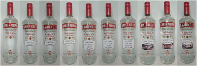
For those in the pictorial warning condition, an appropriate image was chosen to reflect each warning: ‘Alcohol damages your health’ (image of blood pressure test); ‘Alcohol causes liver disease’ (image of person clutching their liver); ‘Alcohol causes mouth cancer’ (image of CT scanner in a hospital). For consistency, in each condition participants were shown an image of a bottle of Smirnoff Red Label No. 21 vodka.
You can see the bottles below (click to enlarge).
After being shown a photo of a selection of these bottles online, participants were asked whether they agreed with such statements as 'These alcohol products would make me aware of the health risks of drinking' and 'I find these alcohol products off-putting'. They were also asked to rate the Smirnoff bottle from 1 = ‘Very Unappealing’ to 5 = ‘Very Appealing’.
Can you guess what the results were? Of course you can. Anybody could. The people who saw the bottles that had been vandalised with graphic health warnings said they found the product less appealing that the bottles that had been left alone.
After controlling for covariates, participants who viewed products with warnings were significantly more likely to perceive the products as unappealing and socially unacceptable than the control condition.
You don't say!
Look, I'm sure this is only the start of a new gravy train for 'public health' researchers so let me save the taxpayer some money and explain upfront that you will get the same result, every time, for any warning on any product. We don't need any more studies telling us that if you make something less appealing, people will say it looks less appealing.
But we also know from long experience with tobacco that such sentiments do not translate to behavioural change in practice. We know this because it has been shown in randomised controlled trials and because graphic warnings made not a jot of difference in the first country to implement them. Sorry, but RCTs and real world evidence trump online surveys.


No comments:
Post a Comment