An article in Bloomberg Business reports that the tobacco industry's latest court case against the British government is underway. The dispute is over plain packaging and intellectual property. The article mentions that the impact of plain packaging has been 'hotly disputed' but then shows a graph that seems to provide prima facie evidence that it was instrumental in bringing about an unusually large drop in the smoking rate.
Not only does the graph show an acceleration in the decline of smoking prevalence after plain packaging came in, but it also shows an even bigger decline after graphic warnings came in. Result! What more proof do you need?
The only problem is that it's total bollocks. The graph bears no relationship with reality. Smoking prevalence data in Australia is collected in the National Health Survey and published by the Australian Bureau of Statistics. The ABS happened to publish their latest smoking data this week and their graph looks very different:
Notice any large drop off in recent years? No. The ABS data shows the same gradual decline in the smoking rate that has been seen in nearly all wealthy countries in the past twenty years. Bloomberg's graph is irreconcilable with the ABS data, but I know which one I trust.
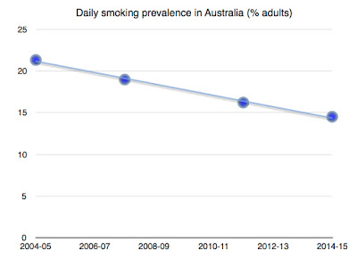
Eagle-eyed readers may have noticed an inconsistency in the ABS graph. There is a three year gap between the 2004/05 and 2007/08 data points and a three year gap between the 2011/12 and 2014/15 data points, but a four year gap between the 2007/08 and 2011/12 data points.
What happens when we plot the data to scale and combine the genders? Nothing much. In fact, you can thread a perfectly straight line between the data points.
Nice try Bloomberg, but there's still nothing to see here.


No comments:
Post a Comment