

Talk of 'health inequalities' is very common at the NHS. The graph below shows a clear gap between different socio-economic classes, and yet it is worth noting that the richest people had a higher rate of heart disease mortality in 1995 than the poorest people in 2008. That is quite something.

How do we explain this incredible decline? The graphs below, which are from the same document, shed some light but, in my view, do not fully explain it. I post these here for my, and your, reference.
First up is smoking which saw the bulk of the decline between 1974 and 1990.

Secondly, there is fat consumption which did not really begin to fall until 1980.

The next graph is one to throw in the faces of those who lament the supposed decline of the British diet since the wholesome days of the 1950s. Per capita consumption of vegetables has changed very little since the war while fruit consumption has more than quadrupled. You have globalisation to thank for that.

The graph below shows high blood pressure. Interestingly, prevalence has changed very little since 1998 (when this graph begins) and so it does not correlate with heart disease mortality at all (nor do rates of obesity, which increased significantly between 1970 and 2000).

Then there are medical interventions. The first involves prescription medicines which have boomed in the last 15-20 years.

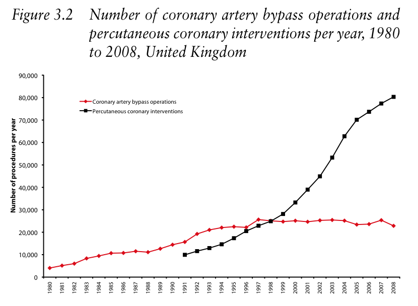
And then there are operations. This graph shows the number of percutaneous coronary interventions (better known as angioplasty) and heart bypass operations carried out. Both procedures are conducted far more often than they were in 1980.
Have I missed anything?
PS. Despite this decline, deaths from 'non-communicable diseases' have continued to rise, which kind of proves what I said in Spiked this week.
6 comments:
The fact is there are only 2 types of people in this world the dead and the dying.
The graphs for mortality are all well and good; but, a graph of the 'incidence rate' of CVD will show no such decline.
Graphs for the 'incidence rate' and mortality from respiratory diseases will show no such decline.
Alzheimer's disease = ditto.
Fewer deaths from one disease only mean an increase in the deaths from some other disease.
And, 50% of deaths will always be premature!
Gary K.
Le Fanu has been publicising for years the notion that the increase and then decline of heart attacks looks more like the case of a disease caused by infection than like anything else.
Anyway, trying to explain the decline while ignoring the increase seems to me to be unlikely to be fruitful.
Yes, Le Fanu reckons the pattern is more characteristic of infectious disease, specifically Chlamydia. See his book "The Rise and Fall of Modern Medicine"
Tony
O/T Sorry.
Here’s a[nother] story that shows up the Tobacco Control Industry for the stupid, dangerous twits they are.
According to the TC nincompoops, The Children™ are attracted by the “glitzy” cigarette packaging, risking them becoming one of those “perverse”, terrible smokers. So, the cigarette packs must be hidden from display, lest The Children™ become overwhelmed with the desire to smoke. Then, let’s remove all the seductive, tempting colours on the packs to Save® The Children™. Yet here we have The Children™ now smoking [more than cigarettes] a substance (marijuana) that isn’t on retail display, doesn’t come in glitzy packs (or packs at all), and .....dare I say it.... is illegal for children and adults alike. (I’m only guessing, but marijuana is probably cheaper than cigarettes, also thanks to TC).
And The Children™ think marijuana is safer than tobacco. Given the denormalization and inflammatory rhetoric surrounding tobacco, it wouldn’t be surprising if The Children™ thought that heroin and cocaine..... or even drain cleaner and sulfuric acid, or a petrol cocktail.... were safer than tobacco.
Three cheers for the nitwits of Tobacco Control.
CDC: More US teens smoke marijuana than cigarettes
http://www.foxnews.com/health/2012/06/08/cdc-more-us-teens-smoke-marijuana-than-cigarettes/print
i don't know much about cocaine, that's probably around alcohol in terms of harms (i do know acute toxicity of cocaine is less, 1:15 versus alcohol 1:10). but heroin is morphine diacetate, or diamorphine, and has the same safety profile as morphine. the harms come from dirty needles, needle sharing, and adulterants in street heroin, NOT the drug itself. pure pharm grade heroin's only long term effects are dependence (addiction) and constipation. It otherwise does no damage to the organs, kidneys, liver, brain, heart, etc. the myth of 'heroin overdose' and respiratory suppression sadly still persists to this day, even though overdose from morphine opiates by themselves are rare, and cause agitation, rather than respiratory suppresion, and hallucinations. the real causes of overdose are drug interactions: combining heroin with alcohol, benzodiazepines, or cocaine. With alcohol and benzos for example the user dies from choking on vomit that, because of the combined effects of another CNS depressant with heroin, they fail to cough out. the therapeutic index, or acute toxicity, of morphine opiates like heroin is 1:70 nicotine is about 1:50 but this is not as important as chronic toxicity, which is hard to say which one is safer. but the point is that heroin, despite popular opinion, is not a seriously harmful drug. just like nicotine, the harms rather come from the manner in which the drug is taken or the delivery system. street heroin IS however dangerous because of the cuts and lack of sanitation, thanks to prohibition of course.
http://www.peele.net/lib/heroinoverdose.html
http://flag.blackened.net/daver/misc/hummel.html
http://www.news-medical.net/news/2007/03/04/22345.aspx
Post a Comment